ShopDreamUp AI ArtDreamUp
Deviation Actions


![Gardener Man [Redraw]](https://images-wixmp-ed30a86b8c4ca887773594c2.wixmp.com/f/65b7390b-6e21-44ae-82f6-dc491a83c754/ddz21uu-8e363fa3-61f3-4289-866c-0c34ad3c55ae.png/v1/crop/w_184,h_184,x_0,y_22,scl_0.09714889123548,q_70,strp/gardener_man__redraw__by_yellydany_ddz21uu-92s-2x.jpg?token=eyJ0eXAiOiJKV1QiLCJhbGciOiJIUzI1NiJ9.eyJzdWIiOiJ1cm46YXBwOjdlMGQxODg5ODIyNjQzNzNhNWYwZDQxNWVhMGQyNmUwIiwiaXNzIjoidXJuOmFwcDo3ZTBkMTg4OTgyMjY0MzczYTVmMGQ0MTVlYTBkMjZlMCIsIm9iaiI6W1t7ImhlaWdodCI6Ijw9MTg5MSIsInBhdGgiOiJcL2ZcLzY1YjczOTBiLTZlMjEtNDRhZS04MmY2LWRjNDkxYTgzYzc1NFwvZGR6MjF1dS04ZTM2M2ZhMy02MWYzLTQyODktODY2Yy0wYzM0YWQzYzU1YWUucG5nIiwid2lkdGgiOiI8PTEyODAifV1dLCJhdWQiOlsidXJuOnNlcnZpY2U6aW1hZ2Uub3BlcmF0aW9ucyJdfQ.ZGHHN_e4C-B35LjtWanvrQjd9PY8dPXfouUPWqqPezI)
![Gardener Man [Redraw]](https://images-wixmp-ed30a86b8c4ca887773594c2.wixmp.com/f/65b7390b-6e21-44ae-82f6-dc491a83c754/ddz21uu-8e363fa3-61f3-4289-866c-0c34ad3c55ae.png/v1/crop/w_92,h_92,x_0,y_11,scl_0.04857444561774,q_70,strp/gardener_man__redraw__by_yellydany_ddz21uu-92s.jpg?token=eyJ0eXAiOiJKV1QiLCJhbGciOiJIUzI1NiJ9.eyJzdWIiOiJ1cm46YXBwOjdlMGQxODg5ODIyNjQzNzNhNWYwZDQxNWVhMGQyNmUwIiwiaXNzIjoidXJuOmFwcDo3ZTBkMTg4OTgyMjY0MzczYTVmMGQ0MTVlYTBkMjZlMCIsIm9iaiI6W1t7ImhlaWdodCI6Ijw9MTg5MSIsInBhdGgiOiJcL2ZcLzY1YjczOTBiLTZlMjEtNDRhZS04MmY2LWRjNDkxYTgzYzc1NFwvZGR6MjF1dS04ZTM2M2ZhMy02MWYzLTQyODktODY2Yy0wYzM0YWQzYzU1YWUucG5nIiwid2lkdGgiOiI8PTEyODAifV1dLCJhdWQiOlsidXJuOnNlcnZpY2U6aW1hZ2Uub3BlcmF0aW9ucyJdfQ.ZGHHN_e4C-B35LjtWanvrQjd9PY8dPXfouUPWqqPezI)


Description
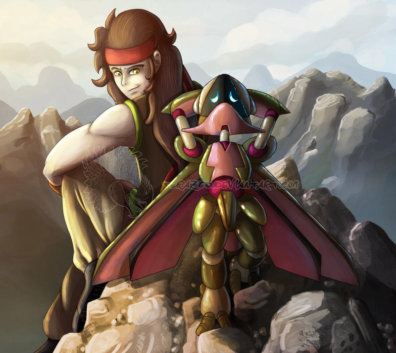
Benisuzume needs more love.
I wanted to experiment with warm lighting here, and rocky mountains, because my mountains had always been lame so far.
I'm quite happy with the rocks, not as happy with the lighting but oh well.
READ THE COMIC HERE: altairsky.deviantart.com/galle…
Support me on Patreon! www.patreon.com/altairsky
:origin()/pre06/f290/th/pre/i/2015/320/8/1/page_420___back_home___suzumega_medabot_by_altairsky-d9gx14y.jpg)
:origin()/pre14/bc16/th/pre/i/2016/046/a/f/page_337___attempt___suzumega_medabot_by_altairsky-d97x19n.jpg)
:origin()/pre07/2a0b/th/pre/i/2016/020/1/f/loss_06___suzumega_medabot_by_altairsky-d9oneyl.jpg)
I wanted to experiment with warm lighting here, and rocky mountains, because my mountains had always been lame so far.
I'm quite happy with the rocks, not as happy with the lighting but oh well.
READ THE COMIC HERE: altairsky.deviantart.com/galle…
Support me on Patreon! www.patreon.com/altairsky
Image size
2700x2400px 749.71 KB
© 2017 - 2024 AltairSky
Comments53
Join the community to add your comment. Already a deviant? Log In
Reindeer Knight riding into your comments for Critmas <img src="e.deviantart.net/emoticons/w/w…" width="25" height="20" alt="
I think the strongest part of this piece is the expressions, body language, and interaction between the two characters. It seems pretty clear that they know each other and have an established connection. The warmness of the lighting is nice too; it looks like they’re up there at sunset. My only critique for lighting would be that Altair’s lower leg is so bright it seems like there’s a separate light coming from below, when everything else seems to be sunlit from the top left.
You mentioned having trouble with drawing humans; doing anatomical studies is always going to be the best tool for that. We tend to be much more critical of human representations than animals, robots, etc. because we have a built-in sense of how humans should look. Here, a couple things stick out to me:
<img src="e.deviantart.net/emoticons/b/b…" width="10" height="10" alt="
<img src="e.deviantart.net/emoticons/b/b…" width="10" height="10" alt="
The background is quite nicely done, though it might help to have a little more detail on the rocks they’re sitting on, as it seems incongruous otherwise, whereas the sketchy style works better in the background as the mountains would look hazy at a distance anyway.
Hope that helps, and merry Critmas from the Reindeer Knights!